Identity
Care, made visible.
A web identity for HÓTICO built on the official guidebook — the logotype, Deep Indigo, the short logotype Ó and the pattern — plus what a website needs: depth, warmth and motion.
The accent is the attention.
The ring of the Ó is the guest’s 360° journey — from the first message to the next booking.
The accent is what HÓTICO adds to it: attention. A small mark that turns an ordinary letter into something personal — exactly what the platform does for a hotel.
Logo
The original logotype, unchanged: only the official files, scaled proportionally. Deep Indigo with the periwinkle Ó on light backgrounds, all white on indigo and night.
Allowed
- Original logo files only
- Proportional scaling
- Minimum size 120 px (25 mm)
- Clear space: the height of the letter H
Not allowed
- Colours outside the guidebook
- Distorting or rearranging elements
- Shadows, outlines or other effects
- Busy or high-contrast backgrounds
The Ó mark
The short logotype Ó is always one colour: Deep Indigo or periwinkle on light, white on indigo and night. It becomes the app icon, favicon and loader, and the ring that runs through the site.

Colour
The palette comes from the HÓTICO guidebook. For the web we added three supporting tones — they never touch the logo.
Guidebook palette
Web extensions
Pattern
Half-rings and accents of the Ó, white at low opacity on Deep Indigo — as in the guidebook. It appears on indigo screens: who HÓTICO is for, partner principles.
Typography
The corporate font is Malgun Gothic: headlines 36–42 pt in Deep Indigo, body text 12–14 pt in #1E1E1E — for documents and presentations. It’s a Windows system font, missing on Mac and mobile devices, so the website uses Manrope: a geometric sans with the same soft, precise shapes and full Cyrillic.
A geometric sans that echoes the round, confident letters of the logo. Full Latin and Cyrillic.
The human voice of the brand: one or two words per headline — Care, together, the guest.
Small technical labels, numbers and interface details — the intelligence inside.
Photography
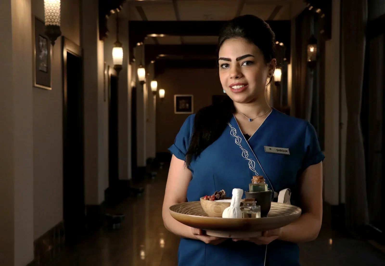
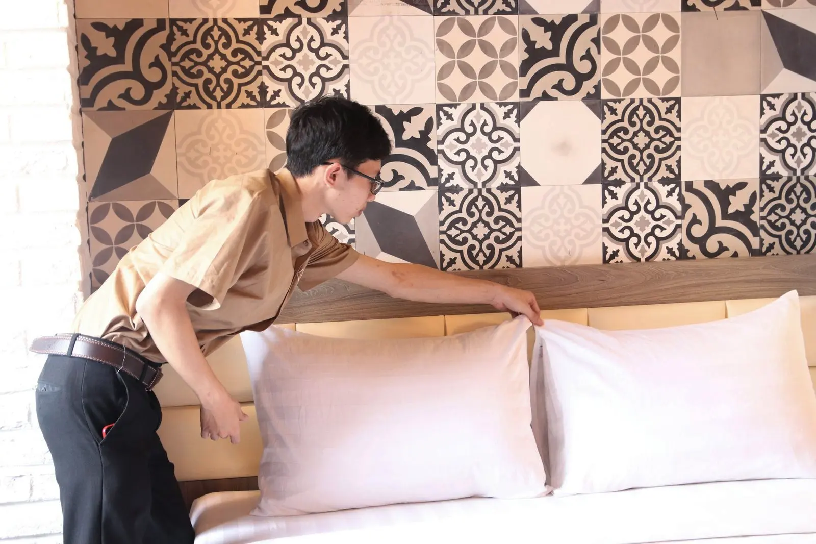
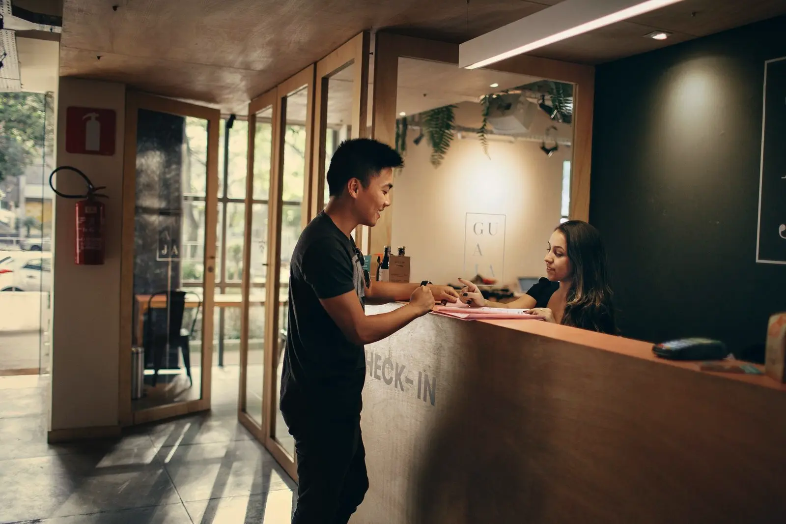
Real moments of hospitality: people at work, rooms being prepared, the front desk. One house grade for every picture — softened colour with indigo in the shadows, warm light kept.
Motion
- From storm to orderThings arrive scattered and settle into one ring — the story of the product.
- One gesture per sectionEvery block has one clear interaction; everything else supports reading.
- Calm by defaultSoft easing, no flashing; full static version with reduced motion.
Voice
- Warm, not sugaryWe talk about care — and back it with concrete features.
- Clear, not technical“Every channel in one inbox”, not “omnichannel communication layer”.
- Proven, not loudOnly real numbers: 50+ hotels, 12 goals, 20+ years, 95%+ accuracy.
The HÓTICO identity and website were designed and built by studio lobod.rocks